Ready to chat?
Get in touch to get started with your project.
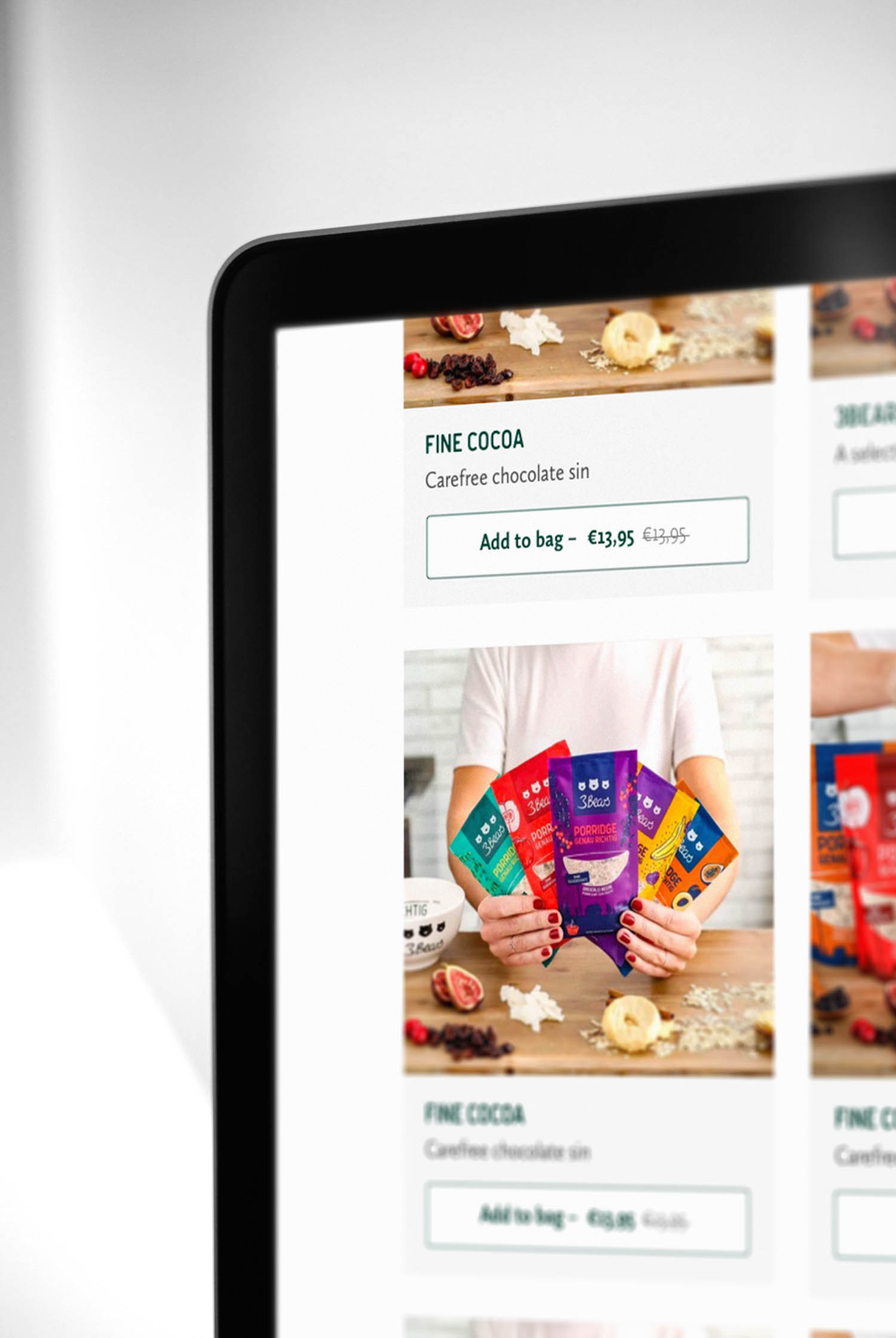
Ecommerce upgrades for a porridge startup based in Munich, Germany. We redesigned their navigation, product pages, and a mix-and-match feature to increase conversion into checkout.
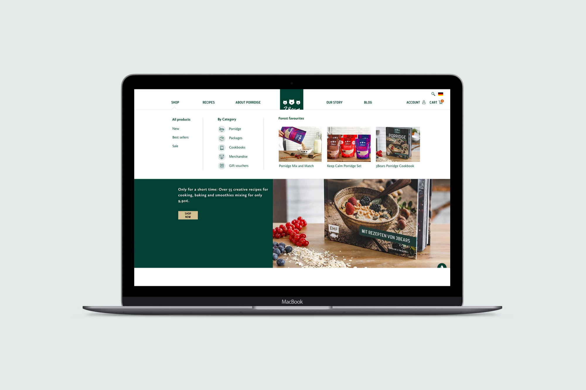
3Bears were using a template for their Shopify store. Looking to grow further, they wanted to maximise conversions and reduce drop-off from their social media and marketing campaigns.
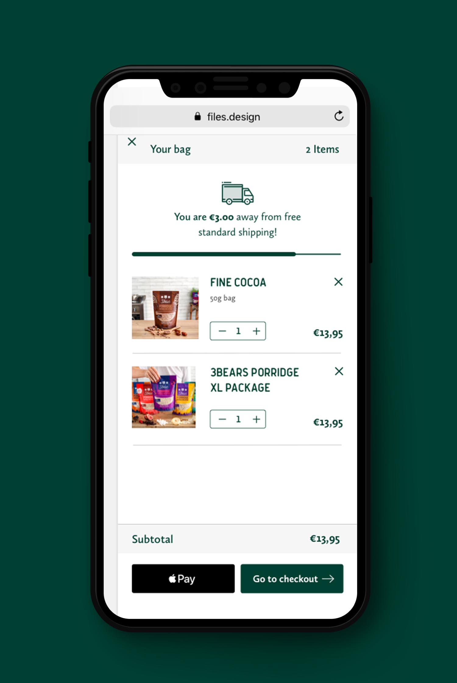
Everyone hates shipping costs. We added a progress bar to make the shopping bag look unfinished until enough items are added for the order to receive free shipping.
People are more likely to buy when they’re already committed to a purchase. We added related items to the basket so that they can added with one click.
Research shows that the less actions a user has to take, the more likely they are to convert. With the new menu, users are able to find exactly what they are looking for without digging through multiple pages.
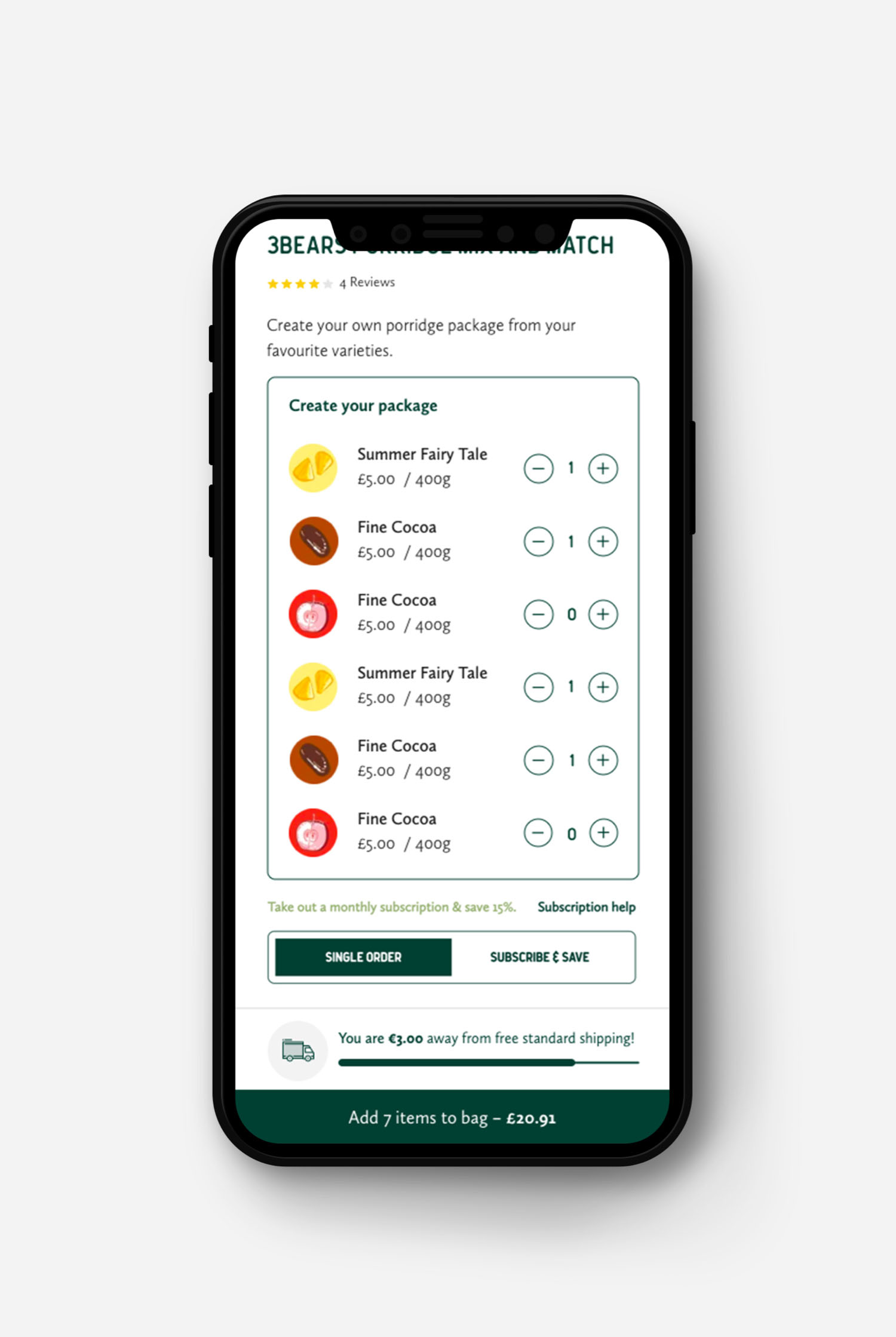
On the product page, we created a mix-and-match porridge picker. The result is that by choosing their favourites, users feel invested and are more likely to complete their purchase.
Get in touch to get started with your project.